
Kaizan – Japanese Sushi Restaurant
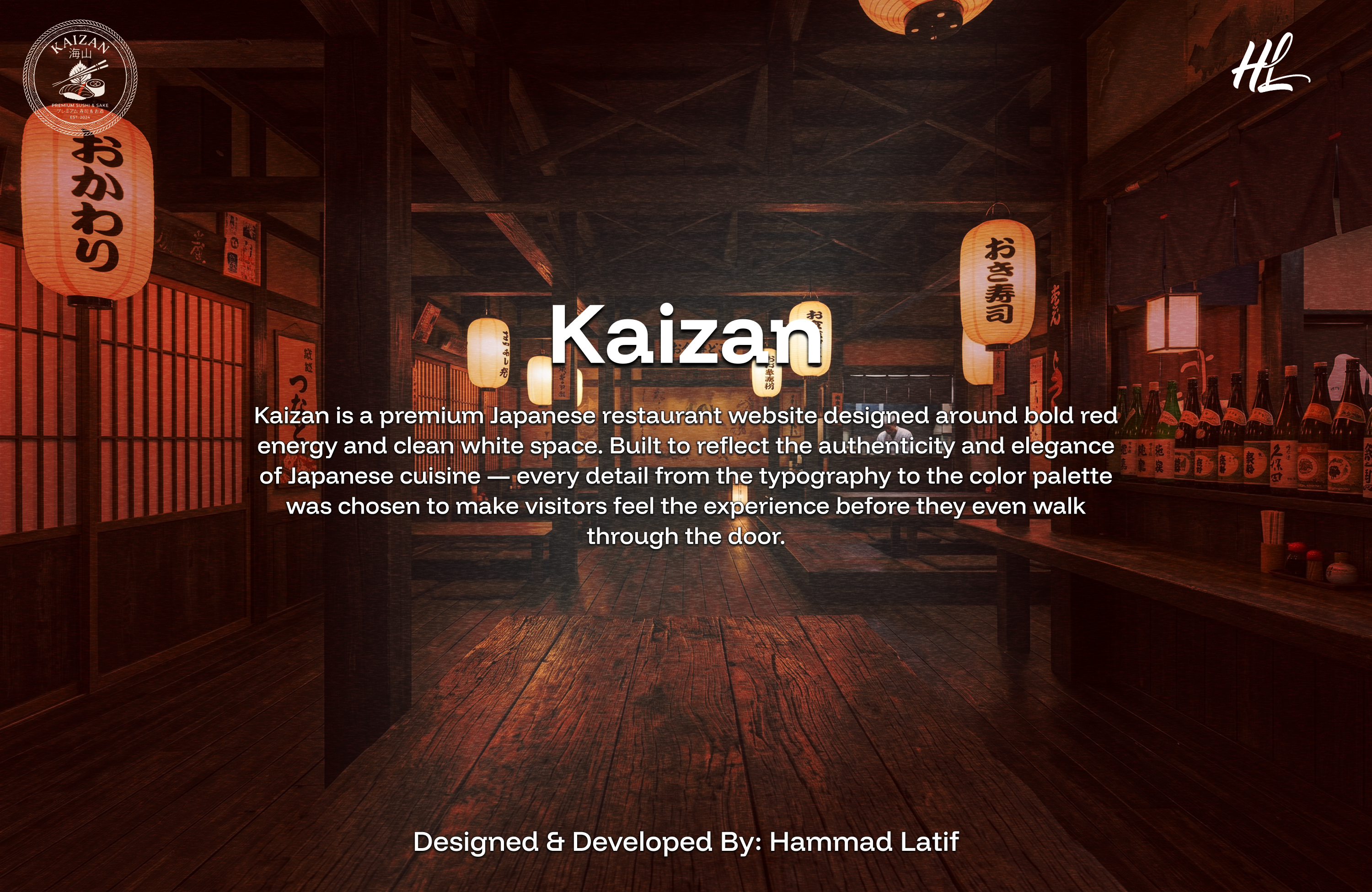
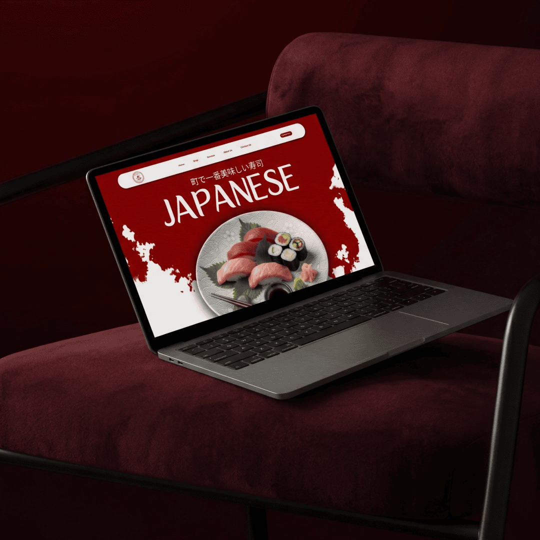
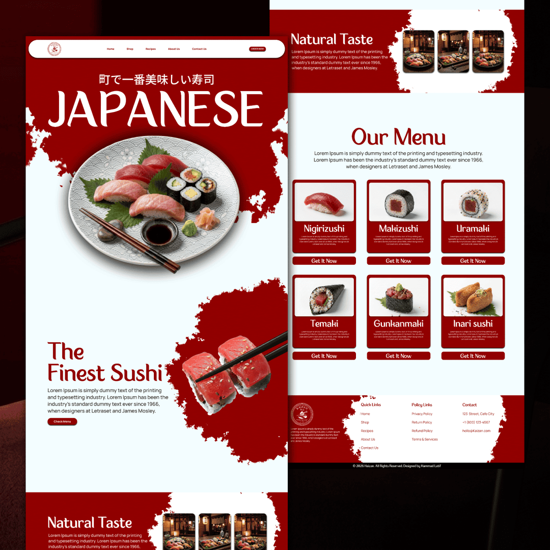
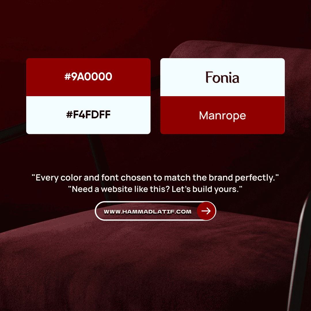
Kaizan is a premium Japanese restaurant website designed around bold red energy and clean white space. Built to reflect the authenticity and elegance of Japanese cuisine — every detail from the typography to the color palette was chosen to make visitors feel the experience before they even walk through the door.
The Challenge
Kaizan needed a website that felt as premium and authentic as their cuisine. The challenge was creating a visually rich experience that balanced stunning design with a clean, easy-to-navigate layout — one that turned visitors into reservations without overwhelming them.
My Approach
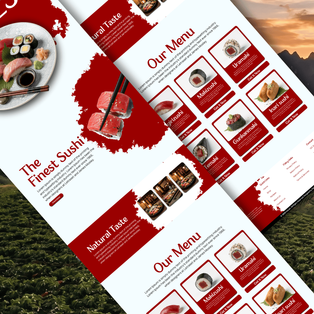
A brand-first design strategy was used — bold red tones, clean white space and Japanese-inspired typography were combined to create an immersive dining experience online. Every section was structured to guide visitors naturally from discovery to reservation.
Key updates included:
The Outcome
The final website delivers a premium feel that perfectly matches the Kaizan brand identity. Visitors are immediately drawn in by the bold visual experience and guided smoothly toward making a reservation. The site feels trustworthy, authentic and built for Japanese food lovers.
Results included:
What Was Delivered
This project included complete UI/UX design and frontend development for a Japanese sushi restaurant brand. Every detail — from typography to color — was chosen to reflect the Kaizan identity and drive reservations.
"We knew we wanted something bold but we had no idea it would turn out this good. Hammad understood our brand immediately — the red, the typography, the whole vibe. Our customers keep complimenting the website and we've seen a real increase in reservations since launch."
Kaizan